

Did Coca-Cola Need A Rebrand?
Pixenium Team23 Jul 2026Strategy
 CREDIT: COCA-COLA
 CREDIT: COCA-COLA
What Pixenium Thinks
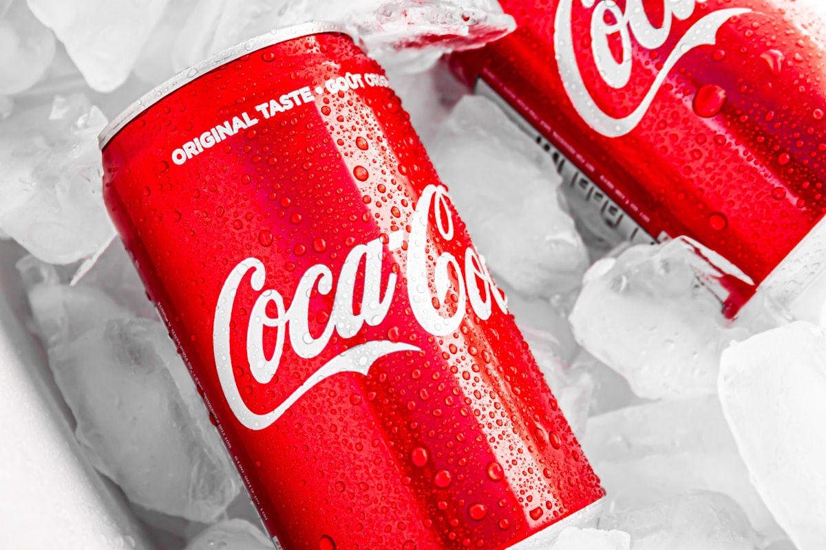
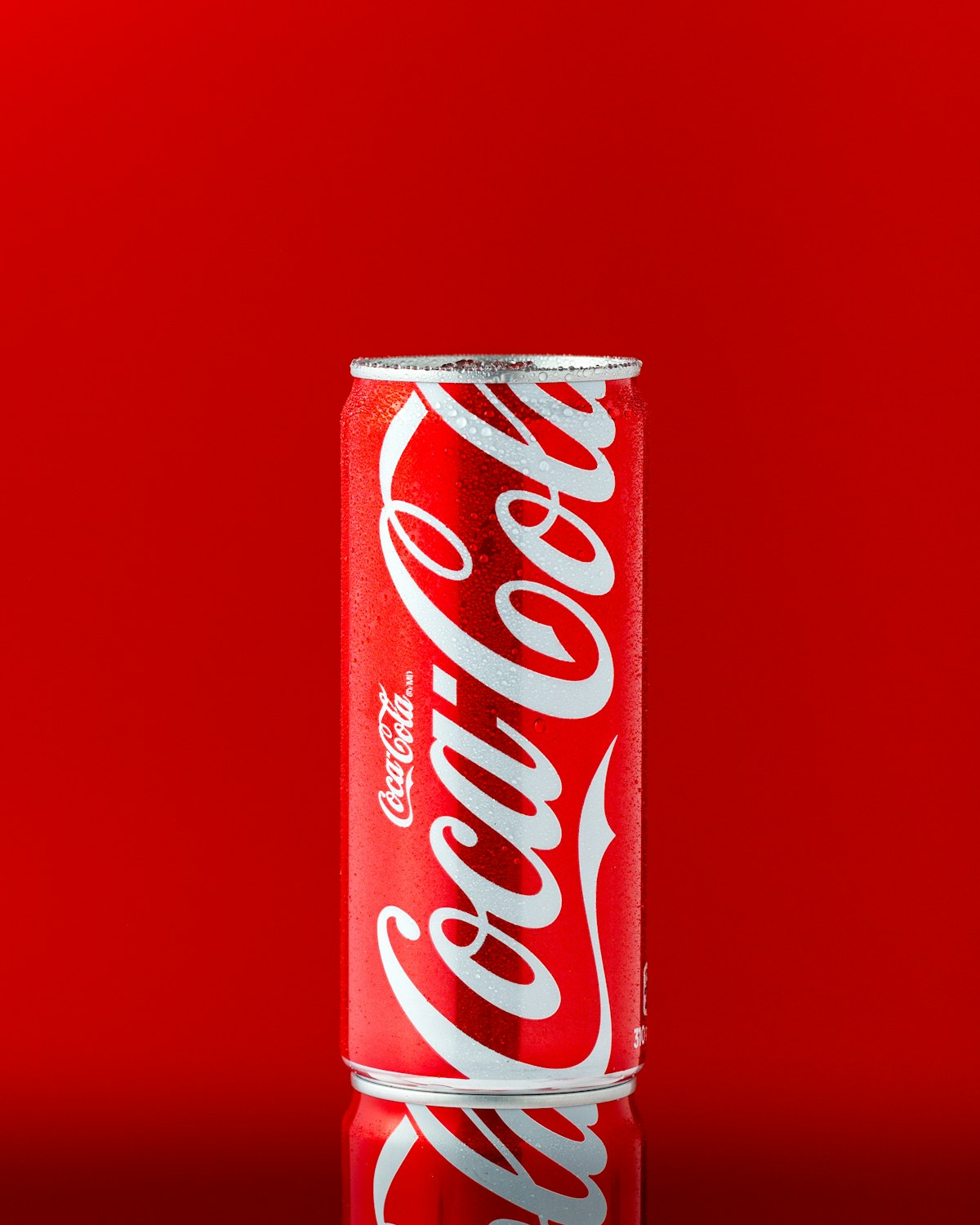
Coca-Cola is a masterclass in timelessness. What Pixenium thinks is brilliant here is the absolute stripping away of unnecessary gradients and drop shadows. The flat design is not just a trend. It is a functional requirement for global digital scalability. By reverting to the core red and white, Coca-Cola ensures perfect legibility across every screen size. The biggest takeaway for any brand is this: if your identity does not work at 16 pixels on a mobile screen, it does not work at all.
Coca-Cola latest redesign shows how small changes can make a big difference. A simpler logo, stronger colours and clearer product messaging make the identity more flexible and recognisable.
The global beverage giant realized that scaling across digital platforms required a flat, highly legible design language. By stripping away the drop shadows and gradients of the past, Coca-Cola has future-proofed its visual identity for the next decade.
For designers, it is a useful reminder that good branding is not always about creating something new but also making sure the things that already matter get the attention they deserve.