The Psychology of Luxury Digital Design: Turning High-Net-Worth Visitors into Enterprise Clients
High-net-worth individuals and C-level executives evaluate digital design differently. Learn how restraint and micro-interactions command premium pricing.
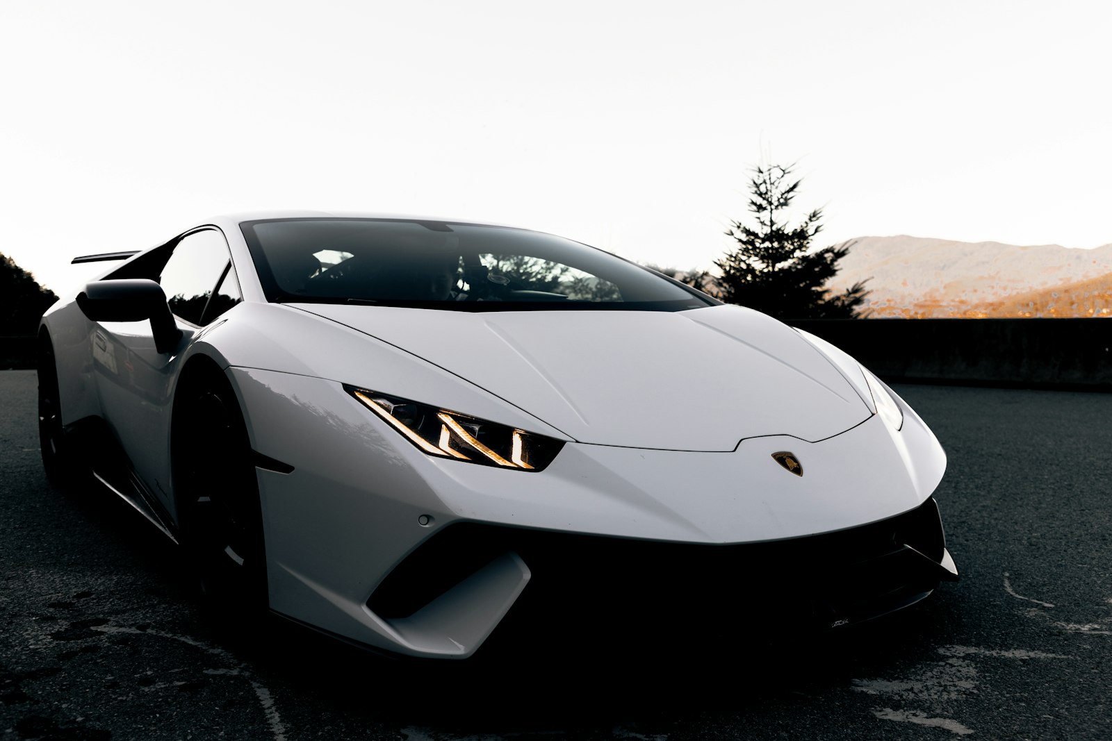 CREDIT: UNSPLASH / AUTOMOTIVE LUXURY
Executive Brief • Key Takeaways
Affluent buyers and enterprise executives associate visual restraint with confidence and financial stability. Intrusive popups, flashing banners, and aggressive countdown timers immediately signal low product value. Custom micro-interactions, smooth easing curves, and tactile typography create a bespoke digital experience. Dark mode interfaces and high-contrast monochrome palettes project timeless luxury and architectural sophistication.
If you are selling a $50,000 enterprise contract, a luxury residential property, or an institutional fintech platform, your website cannot look like a discount e-commerce store. Your digital interface must embody the same prestige as a flagship boutique on Bond Street or Fifth Avenue.
The Psychology of Visual Restraint
In consumer psychology, perceived value is inversely proportional to visual desperation. When a visitor lands on a webpage that assaults them with three floating popups, an exit-intent modal, and bright red countdown clocks, their brain triggers an instant defensive reaction: This company needs my money desperately.
Luxury digital design operates on the opposite principle: Confident Nonchalance. By giving every element generous negative space, maintaining a disciplined monochrome color palette, and letting the work speak for itself, you subconsciously position your offering as exclusive and highly coveted.
Micro-Interactions as Modern Craftsmanship
Just as a Swiss luxury timepiece communicates prestige through the weight of its bezel and the smoothness of its second hand, a luxury website communicates authority through the physics of its interactions.
Smooth momentum scrolling, elegant link hover transitions with custom cubic-bezier easing curves, and refined image reveal effects create a sensory feeling of effortless luxury that cheap templates can never replicate.
"Prestige is not added at the end with gold gradients. It is baked into the fundamental physics, spacing, and typography of the interface."
Typography as the Mark of Distinction
Luxury design demands typographic mastery. Tight letter-spacing on display headlines, generous line-height on editorial body copy, and strict alignment grids project architectural discipline. When every pixel is intentional, high-net-worth clients recognize that the same level of care will be applied to their business.
 CREDIT: LUXURY WATCHMAKING CRAFT
What Pixenium Thinks
Studio Perspective & Market Analysis
“Cheap websites scream; luxury platforms whisper. When an agency or brand clutters their homepage with screaming discount badges and desperate 'Book a Call Now' popups, they are broadcasting insecurity. High-ticket buyers and enterprise decision-makers seek quiet confidence. They look for meticulous attention to detail, generous whitespace, and flawless typography. In digital design, restraint is the ultimate sign of prestige.”